Friday, March 18, 2011

Body copy and how I feel about it.


This exercise was to pick 10 different bodycopy typefaces and write our name and described how it makes us feel.

Edited Posters


After listening to the comments and feedback from the critique yesterday, I corrected the things that needed changing, above is the next version of my elderly exercise poster.


Once again I took on board the comments that were made about the poster and made the changes accordingly. The changes I feel were positive and made the posters stronger.

Thursday, March 17, 2011

Posters - InDesign


I tried to keep it simple, with the use of type to compliment the image, I also tried to use colours that were already in the image.

Although this poster isn't the correct size, to me it is a very powerful message portraying the fallen soldier. Maybe the colour of the type needs to be different.

This poster shows a proud young soldier, he was willing to go to war, to fight for freedom but to also fight for the new commonwealth.


I wanted to make this poster a bit more colourful, I hoped it would draw attention to the message, possibly a different display type could have been used.

Wednesday, March 16, 2011

Abstract Art - Playing with Textures


These pieces were done in Illustrator then taken into Photoshop, where I asked Ani to show me how to put texture into them. The original concepts came from IDN, I thought that they would be easy to create, maybe with more experience but the overall finished pieces now have that depth that they were lacking before.

Hand drawn piece for Zine


This piece was inspired by a image that I found in IDN, I liked the way the letter M seems to stand out in the foreground. I love drawing things like this by hand, I find it very soothing.

Tuesday, March 15, 2011

Packaging Creations

These are the three packages that we had to recreate, it would have been a lot harder if we had to do every single bit by ourselves. You just don't realise what lengths some people will go to in creating and marketing packaging. There is a great deal and thought that goes into a layout and design of each package.


Volunteer Poster - Illustrator

This is the first in a series of posters that Luke has asked us to create, I didn't want to use any images for this one because I thought that the use of type alone would possibly be more powerful, maybe the use of different type would make this better.

Thursday, March 10, 2011

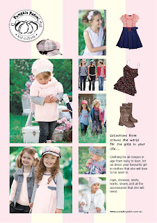
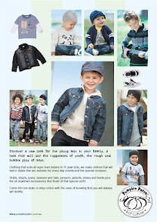
Pumpkin Patch - InDesign


With this I wanted to create a separate page for both genders, keeping the softer colours for the girls and the blues for the boys, it probably needs a bit more work as these pages should have been made with facing pages.
It was good using the gap tool and the cutting out tool, it was so much easier than using the pen tool to cut around the shapes.

Monday, March 7, 2011

Typography exercise - In Design


I was using transparencies to create this bit of typography, I wanted to keep the design simple and try to fit the word typography into a rectangle shape.

Playing with gradients


I was playing with gradients, trying to change the direction and control the colour.