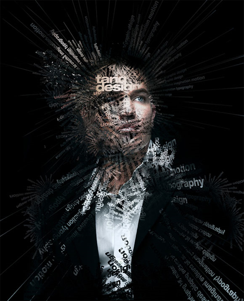
Its as if he cant control whats in his head, the words are just exploding out. The different typefaces used is fantastic, mixing serifs with san serifs.
 Although this is handwritten, what an amazing effect it has, the man is just climbing out of the page at you. It is so well done.
 I really enjoy this whole layout, the colours, the background and the way they have extended the t and i. It has an abstract feel about it.
  This piece makes you look right into the depths, you can see symbols and some lettering throughout, I don't know if you could call this typographic art, but I find it very interesting.
 The typeface has nice clean lines with the artistic work added over the top to give the artwork more depth. Lovely use of colours.
 This artwork feels kind of celtic with Arabic influences, an interesting piece.
 What an effective way to use type, combining quilling with typography. How can they say they have run out of ideas?
 Arabic writing has a lovely flow to it, it reminds me of the illuminated scripts you would find in ancient books.
I love the way they have turned the number five into abstract art. The colours are rustic but they really work.
The colours and the typeface used are just great, heart with symbols as well. The textured background works well.

I am a great fan of James Dean, and this image just captured my eye when I saw it. even without the picture next to it I knew who it was instantly.