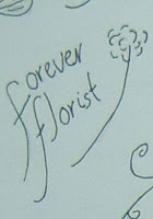


This is my florist logo, I kept this logo simple and using a flowing script and a simple flower that I would replace with a rose with more style creates a endearing logo. The comments were the team were that they enjoyed this because of its simplicity.
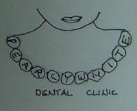
My dental logo was simple in the fact that I wanted a to have a pearl necklace with the words pearly white incorporated into the pearls, the feedback on this was to have the pearls in the shape of teeth.
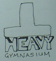
The Heavy T Gym logo was picked for the weight of the t pressing down on the word heavy. Using a different font will give more to this image.
No comments:
Post a Comment