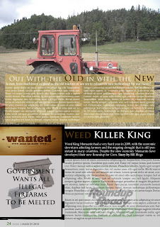
This is my new magazine page, I enjoyed creating this one and a lot more thought went into designing it. Using screened boxes with text in it, leaves the image behind still being able to be seen and giving it more substance to the overall effect of the picture. For the Weed Killer King, I placed the roundup logo in the background and used a light grey tint instead of a white background, this took away the starkness of the white which would have overwhelmed the rest of the page. Instead of adding a third article with a story, I created a wanted poster for the guns, a black and white image of guns being melted could have gone in here as well but I decide on text instead.
No comments:
Post a Comment