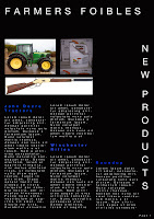
After creating this magazine page, I realised that I was not happy with what I did. I didn't like the simplicity of this page, it looks as if no thought went into the layout, the subject matter doesn't blend with the black background and the blue type is very hard to read. In essence, I hate this attempt, so I went home and started playing with photoshop in my home environment, took a better look at what was required, thought about it a bit more and recreated a new page. I like my next attempt and learning other tools and what I can do with them has given me more scope with what I can do.
No comments:
Post a Comment