Tuesday, March 30, 2010


Cute Chickens for Children's Book


These are the characters that I have developed for use in a children's book. I have one more to character to create and I think his name will be Charlie. The cast of characters and pics.....
Friday, March 26, 2010
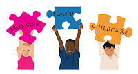
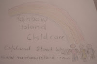
Rainbow Island Childcare Logo Creation
Today's task was to work in groups that we first had to give a name to. The group that I was in was with Pip and Skye so we named the group PMS Designs taking the initials from our names to form the group's identity.
The next task was to meet the client Peter Brown who is starting a childcare centre catering for toddlers up to school age children. In his brief he informed us that they have four staff members and propose to have 20 children, the location of the childcare centre is going to be in Copland Street, Wagga Wagga and the name of the business is Rainbow Island Childcare. In his brief Peter wanted us to create a corporate image that is easily identifiable as a childcare centre and is easy to read. The budget for this job would be in the medium range, although the client didn't actually specify a budget, but to get back to him with some images and prices for the job.
The client wanted a rainbow to feature in this design, but not so much the typical rainbow, the client even tried to create a logo using Microsoft Publisher, but he said that he wasn't too happy with what he came up with, he said it looked very tacky.
After talking with the client, I had some ideas in my head as to what was required. Thinking as to incorporate a island into the logo or just a rainbow, making the logo child friendly (eg. like the ABC childcare logo), and thinking about what kind of things the logo would be going on, for example business stationery, t-shirts for the staff and kids, advertising billboards and buses.
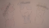
As a group I think we all had individual ideas that we wanted to get down on paper but we also needed to research some ideas and put these ideas down on paper,we worked as a group discussing different ideas that we all had and each of us started to work on some of the ideas we had come up with. We tried different ways to incorporate the rainbow theme using colours and different shapes, each of us came up with a few different designs that we drew in pencil first, then we showed the rest of the group what we had initially drawn to get feedback on the work that we did, commenting on the concepts and how we could improve them, some of the comments were the type of fonts that we would use, the different colours that we could use and other things thqat we could incorporate to make the logo stand out more.
The designs that we offered the client were rough designs that gave the client some ideas of what we could do with the logos and the different colours that we could use in these logos, we could have initially done the logos on the computer and given a more professional showing, but with so many ideas I felt it was good that they were in a more rough form as this would allow us to work more fully on the logo design of the clients choosing. These logos can be expanded on and tightened up with the choice of colours and type, size and style of the final logo.
The feedback from the client was very positive, he had many different ideas to choose from, the critque that he gave the logos that he thought could be enhanced further was appreciated because it let us know that we were on the right track in what the client originally wanted. With the design that I was to improve upon, the feeback was to change the colour of the first jigsaw piece to pink so that it would represent girls.
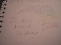
Although my revised design was not complete at the time, the concept was starting to come together, the changes had been made and the design had become more defined in detail than the original idea which was just roughly sketched. Using three children different ethinic backgrounds added more depth to the logo. The text will be eventually dropped into the jigsaw pieces and using different typefaces would add to the overall image.
The groups progress went well, but I feel that I let the side down a bit because I was too slow in doing the computer work and nearly completed the first idea whilst Pip and Skye had produced a couple of different ideas and colour schemes.
The technology is still slowing me down, hopefully with time I'll become more proficient at using the pen tool and being able to speed up whilst using it. I find going around serif typefaces difficult but once again practise will help me improve.
I feel that the logo is progressing well, it started with a really rough idea and has progressed so that there is more detail and the elements in it could be moved closer together so it becomes tighter and getting the vector masks drawn leaving no white space will also enhance this.
The group presented the client with some very well thought out concepts and seeing the progression of these ideas has also made me think of what more you could do to achieve different outcomes. My own creativity is lacking when I see what the other members of the group have achieved and their vision for the logos.
It is hard to put a ballpark figure on a job like this because the client wants us to create the logo, but did this include preparing it for printing in preparation and layout. The figure would also have to include details sych as how many colours will be used, the graphics, time involved in designing the logo. I think initially whilst I'm still learning $500 - $1000 depending on how detailed the logo is.
Yes I did think this is the type of work a graphic designer is involved in.
Although I have past experience using different type fonts, knowing that there is a lot more type fonts out there now gives us a chance to use fonts that are more suitable for what we want and need. I need to just work more with type to get the right feeel that I am after for the job.
I enjoyed working in a group, feeding ideas of one another, and getting feedback as you work was good.
I don't think I could have completed the job properly without the groups input into what could work and what didn't. Working within a group encourages you to try harder.
I think the clients expectations were real, because he had tried to come up with ideas of his own before realising what was involved. Working and creating ideas in Publisher is a lot harder than working in Photoshop and Illustrator.
I feel more time was needed than the one day, but after working in the printing industry I have had to meet unrealistic deadlines, so time management is definitely important.
I need to stretch the brain more and think outside the square, gain more confidence in the use of software and take note of my strengths and weaknesses and utilise members of a group who have a stronger design base to learn from.


More Illustrator Using the Pen Tool

Family Guy was a real challenge, the lines are getting better, I just need to speed up when doing something like this.
Wednesday, March 24, 2010
Using Illustrator


Here are some of the logos we had to use the pen tool on in illustrator, I need some work on these, but like the saying goes, practices makes perfect, and like anything the more you use something the more familiar you become with it.
Thursday, March 18, 2010
Monday, March 15, 2010
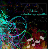
Favourite Music Posters from the Net
 For some reasons the bold colours just seem to jump out at you. Using a circle to me looks like movement (spinning around in dance), it has a native American feel to it. Having a border around it draws the eye to the image. Using only three colours in varying shades also helps with this poster.
 This poster is simple in its design but really works. The purple silhoutte representing the mountains, the rays coming out of the clouds, the way the text appears to be glowing with the outline of gold around and the white text all harmonise well together.
The pastel colours in this poster blend so well with one another, the conductor has so much music inside of him that is exploding out of his head. I like the way the text is wrapped around the treble clef. The use of a script font ties in with the design coming out of the head.
I really enjoy the vibrancy of the colours in this poster, set against the black background gives it so much depth. It seems to draw the eye toward the musical notes.
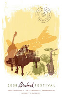
The washed out effect really suits this picture, it makes me think of jazz and the big band era, with the plane in the background it makes me want to travel to exotic destinations to listen to fantastic music. The colours all tone well with one another.
Noise Poster

This is my attempt at the noise poster, I need a bit more work at cutting out in photoshop and the vibrant colours help enhance this poster. The words circling around acts as noise radianting out from a speaker. I created a logo for the t-shirt, I think this may need to have a different colour background as it looks like it was just plonked here but I want to try and create a shirt for the bands (like what they sell at band concerts, it was worth a try).
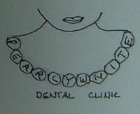
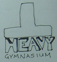
Florist, Dental, Gym Logos

This is my florist logo, I kept this logo simple and using a flowing script and a simple flower that I would replace with a rose with more style creates a endearing logo. The comments were the team were that they enjoyed this because of its simplicity.
My dental logo was simple in the fact that I wanted a to have a pearl necklace with the words pearly white incorporated into the pearls, the feedback on this was to have the pearls in the shape of teeth.
The Heavy T Gym logo was picked for the weight of the t pressing down on the word heavy. Using a different font will give more to this image.
Thursday, March 11, 2010
New Magazine Page

This is my new magazine page, I enjoyed creating this one and a lot more thought went into designing it. Using screened boxes with text in it, leaves the image behind still being able to be seen and giving it more substance to the overall effect of the picture. For the Weed Killer King, I placed the roundup logo in the background and used a light grey tint instead of a white background, this took away the starkness of the white which would have overwhelmed the rest of the page. Instead of adding a third article with a story, I created a wanted poster for the guns, a black and white image of guns being melted could have gone in here as well but I decide on text instead.
Wednesday, March 3, 2010
Five favourite photos!


These are my picks of the five photos that I have taken that I like the best.
Tuesday, March 2, 2010
Magazine Page

After creating this magazine page, I realised that I was not happy with what I did. I didn't like the simplicity of this page, it looks as if no thought went into the layout, the subject matter doesn't blend with the black background and the blue type is very hard to read. In essence, I hate this attempt, so I went home and started playing with photoshop in my home environment, took a better look at what was required, thought about it a bit more and recreated a new page. I like my next attempt and learning other tools and what I can do with them has given me more scope with what I can do.
Subscribe to:
Posts (Atom)