 For some reasons the bold colours just seem to jump out at you. Using a circle to me looks like movement (spinning around in dance), it has a native American feel to it. Having a border around it draws the eye to the image. Using only three colours in varying shades also helps with this poster.
 This poster is simple in its design but really works. The purple silhoutte representing the mountains, the rays coming out of the clouds, the way the text appears to be glowing with the outline of gold around and the white text all harmonise well together.
The pastel colours in this poster blend so well with one another, the conductor has so much music inside of him that is exploding out of his head. I like the way the text is wrapped around the treble clef. The use of a script font ties in with the design coming out of the head.
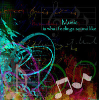
I really enjoy the vibrancy of the colours in this poster, set against the black background gives it so much depth. It seems to draw the eye toward the musical notes.
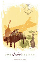
The washed out effect really suits this picture, it makes me think of jazz and the big band era, with the plane in the background it makes me want to travel to exotic destinations to listen to fantastic music. The colours all tone well with one another.
No comments:
Post a Comment