
Edward Steichen's picture of Marlene Dietrich is just amazing. It captures the glamour of the 1940s. The soleful face of Marlene, the bedroom eyes the actual pose, it all gels together to make a powerful portrait. The depth of the picture using the darker clothes and a softer light shinning of Marlene face brings the picture to life.
Robert Adams photographs dipict life as it was, no false imagery, no doctoring of photos, this picture shows a typical American town, manufactered to be the same (keeping up with the Jones'), same style house, same trees and probably similar families living in these houses. It uses more grey scale than the traditional black and white which add to the effectivness of depicting the era.

This photo by Jeff Wall is similar to an image I had the other day whilst out driving and wishing I had a camera with me at the time (although the trees were different in the picture I would have taken). The road to nowhere, the journey begins, where this road leads are all the things I think about when I look at this picture. Has man destroyed nature or is he just passing through. The height of the trees wow! I love the play of the light as it shines through the tops of the trees, but where the road is, its nice and cool (damp looking).
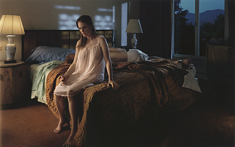
Gregory Crewdson has a way of creating a picture that speaks a thousand words. To me this picture speaks of abandonement, lonlieness, misunderstanding, is this were I'm at! The colours used in this picture help to create that lonlieness with the dark behind her, which allows the light to show her feelings. I like the way the bed, being a big object is not the focal point

This image by Martin Parr typifies the blassay attitude of many people today, ignore the rubbish and sit down and enjoy your meal. This could be a street scene anywhere in the world today. Although taken slighty out of focus it adds to the feel of neglect. I think the main focus of this picture is the architecture and the rubbish.

Cindy Sherman (how do you describe her photographs!), who is this woman, dreamer, dancer, a lonely woman, all these things could describe this picture but has Cindy Sherman lost or found herself in doing all these character portraits of herself. I enjoy this picture and the elements used in creating it. Is the focus on her dreams/desires or on the solitude of reflection. This picture uses light well and the contrast from the open window to the wooden floors (the bright to darker textures) creates a visually pleasing image.

I enjoy this image from Araki, the emotions that he captures in the girl, the doubts and fears the refelection and the details of her gown. The whole composition of this picture unites to tell a story. Black and white photography seems to define more of the elements involved in this picture.

This image by Larry Clark has some great contrasts in the use of the leopard print blanket and the paleness of her skin against his darker skin, the window in the background adds more light to the picture and the use of black and white and greys to enhance the picture. The picture tends to lead you away from the gun and tends to draw you towards the girls feet and I feel you notice the girl is bound more by doing this.

I like this image from Tony Vaccaro, I enjoyed viewing his photos from World War 2, it gives us a sense of time and the conditions that prevailed at the time. The contrast betweeen black and white is really good and the detail seems to be more detailed in black and white than it would in colour. It captures the bleak weather conditions many soliders had to survive in, the continuation of life even through war. It gives you more to look at than just the army girl.
This image photographed by Richard Billingham, has a good contrast use of light and dark, and having the different textures on the wall adds interest to the picture. The subject is slightly off centre. Being in black and white I feel allows more depth to the image.
Cindy Sherman (how do you describe her photographs!), who is this woman, dreamer, dancer, a lonely woman, all these things could describe this picture but has Cindy Sherman lost or found herself in doing all these character portraits of herself. I enjoy this picture and the elements used in creating it. Is the focus on her dreams/desires or on the solitude of reflection. This picture uses light well and the contrast from the open window to the wooden floors (the bright to darker textures) creates a visually pleasing image.
I enjoy this image from Araki, the emotions that he captures in the girl, the doubts and fears the refelection and the details of her gown. The whole composition of this picture unites to tell a story. Black and white photography seems to define more of the elements involved in this picture.
This image by Larry Clark has some great contrasts in the use of the leopard print blanket and the paleness of her skin against his darker skin, the window in the background adds more light to the picture and the use of black and white and greys to enhance the picture. The picture tends to lead you away from the gun and tends to draw you towards the girls feet and I feel you notice the girl is bound more by doing this.
I like this image from Tony Vaccaro, I enjoyed viewing his photos from World War 2, it gives us a sense of time and the conditions that prevailed at the time. The contrast betweeen black and white is really good and the detail seems to be more detailed in black and white than it would in colour. It captures the bleak weather conditions many soliders had to survive in, the continuation of life even through war. It gives you more to look at than just the army girl.
This image photographed by Richard Billingham, has a good contrast use of light and dark, and having the different textures on the wall adds interest to the picture. The subject is slightly off centre. Being in black and white I feel allows more depth to the image.
No comments:
Post a Comment