Sunday, May 9, 2010

Colour Swatches


This exercise was to take a natural photo and using the eye dropper tool, select 16 colours from the photo. Then we had to record CMYK and RGB colours from this photo in colour swatches.

Logos for assessment


These are some of the logos that I have created for the assessment, before I go any further I would like to have some feedback on them. Before I started to create these logos I thought about words that I connect to acupuncture and the place where acupuncture began, lotus blossom, cherry blossom, bamboo, Yin Yang, butterflies and I tried to incorporate these into logos. I also researched alternative medical symbols thus finding one for acupuncture.

Thursday, May 6, 2010

Logo Creations


These logos still need some work and I need to redo fleet star and change some of the others, and do more than one logo for each one, but due to missing Monday's lesson I thought I just needed to get the basics done and work more on them over the next few days.

Wednesday, May 5, 2010

Typographic art


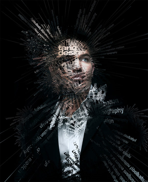
Its as if he cant control whats in his head, the words are just exploding out. The different typefaces used is fantastic, mixing serifs with san serifs.


Although this is handwritten, what an amazing effect it has, the man is just climbing out of the page at you. It is so well done.


I really enjoy this whole layout, the colours, the background and the way they have extended the t and i. It has an abstract feel about it.


This piece makes you look right into the depths, you can see symbols and some lettering throughout, I don't know if you could call this typographic art, but I find it very interesting.


The typeface has nice clean lines with the artistic work added over the top to give the artwork more depth. Lovely use of colours.


This artwork feels kind of celtic with Arabic influences, an interesting piece.


What an effective way to use type, combining quilling with typography. How can they say they have run out of ideas?


Arabic writing has a lovely flow to it, it reminds me of the illuminated scripts you would find in ancient books.


I love the way they have turned the number five into abstract art. The colours are rustic but they really work.


The colours and the typeface used are just great, heart with symbols as well. The textured background works well.


I am a great fan of James Dean, and this image just captured my eye when I saw it. even without the picture next to it I knew who it was instantly.

Four Pictures with Type


We were told to get four pictures off the net and then place them in a document, and put type to the pictures. Choosing the correct typeface to suit the image was hard, I find that it is hard going from one machine to another and only using what typefaces are on those machines, as we are all dicovering each machine will have different typefaces to others.

Wednesday, April 28, 2010

Modern Kraft Poster


Just to get back into the swing of things, we had to create a poster for a Graphic Design Convention called Modern Kraft, we were given a size of 600mm x 265mm with a 3mm bleed all round. We were given the dates of the convention and the location, any other information that we wanted to put on the poster was at our own discretion.

The first poster that I created had an abstract feel to it, the colours were warm and vibrant with the aim of catching passing traffic with the colours, (the criteque of the class when they saw this poster was that they thought it looked like Aboriginal Art due to the colours, the typefaces used needed more work to portray the message. (This could have been enhanced more if we weren't restricted to using only the typefaces found on the computers at TAFE).

The second poster I use tonal colours, and I have since softened the colours by using the opacity and changing the typeface. I have also done this in varying colours to achieve a different ambience to the pink.

Sunday, April 18, 2010

Last children's character


This is Charlie Chicken the last cheeky character.